 SAP SuccessFactors Community Homepage
SAP has had a long-standing relationship with Envision Technology, a marketing firm in the San Jose, CA area. When SAP approached Envision to help with their full-rebrand of SuccessFactors (a sub-brand of SAP), I came on board to assist with the redesign.
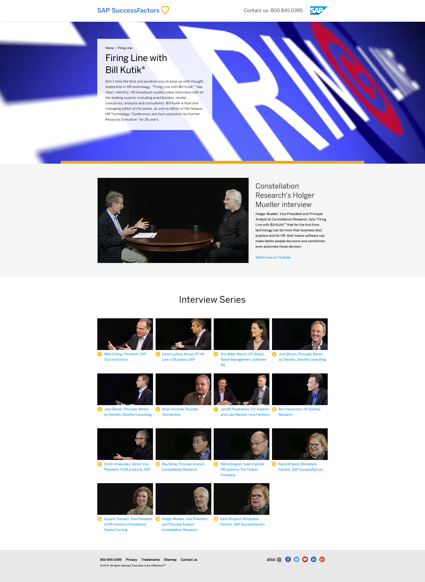
Working with Interactive Creative Director Beth Kamaroff and Senior Designer Nicole Sykes (a true SAP brand guru!) meant redesigning many different types of pages within the existing SF site: Hubs, download pages, landing pages, events and more. In addition, the redesign encompassed custom one-off pages such as The Firing Line with Bill Kutik, SF's Customer Stories page and SF's Leadership pages.
This project took place over several stages. Initially, the main component pages - Hubs, landing pages, success & download pages - were created. Then, since SAP SF had many campaigns using these pages (but in the old brand) it fell to us to reskin all their existing campaigns into the new brand. This included pulling images from SAP's vast image library, and pulling or creating (from scratch) iconography for each campaign.
After reskinning numerous campaigns, I moved on to redesigning the download & success pages - at the tail end of each campaign user flow - with the goal in mind of increasing conversions by clearly displaying downloads (such as PDFs / Whitepapers) & videos.
SAP SuccessFactors Community Homepage
Once the standard page layouts & campaigns were reskinned, I moved on to custom pages. SAP SuccessFactors depends on many pages for specific content - such as the Firing Line with Bill Kutik - to deliver marketing materials to customers. While I worked on reskinning these based on existing content, we also took a critical look at the UX of each page to see how it could be improved without significant impact to SAP SF's development teams.
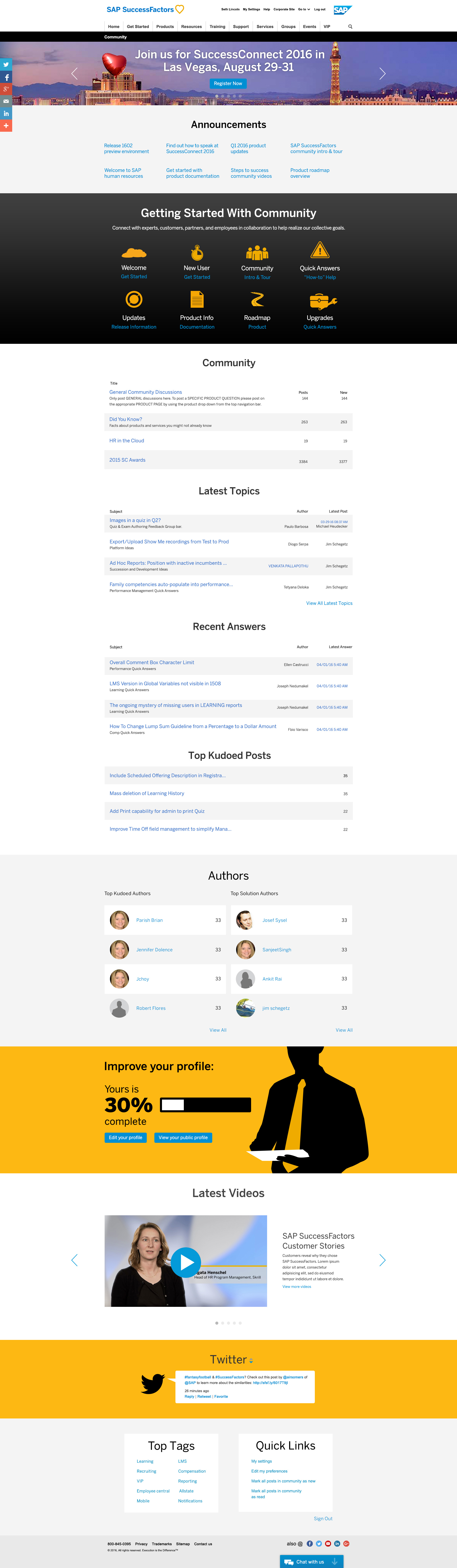
One of the largest redesigns on this portion of the project was a new look for SAP SF's Community home page - a jumping off point for discussion, events, and numerous other important elements of SAP SF's online offerings. The old page was cramped and lacked easy readability, so I began by opening things up quite a bit, and constantly consulting SAP SF's new UX/Design guidelines to ensure consistency and adherence to their latest brand principles.
 SAP Firing Line With Bill Kutik Page
As pages were completed, two additional tasks were required: Mobile conversions (which were provided to dev teams) and creation of delivery files. SAP SF's process for handing design to development includes creation of delivery files consisting of cut images, comps for each page in a campaign flow, PDFs for UX and word counts, and working files (PSDs, etc.).
This process required meticulous attention as SAP's dev teams follow the UX documents and comp designs to an incredibly high level of precision; thus the UX docs must specify all dimensions, parameters, colors, and fonts exactly as shown in comps to help ensure a minimum amount of kickback between design & dev teams.
In total, over 30 pages were redesigned and converted for mobile, again requiring UX documents and sliced images to keep mobile file size at a minimum.

We hired Seth via an Agency, and what a great find! He assisted us with creating visual deliverables to rebrand two responsive websites. No task was too small or large, and he met many tight deadlines while juggling multiple projects. His efficiency, knowledge, and pro-active abilities were wonderful to work with. His great attitude and skill set is a combination that you will want to hire. He was essential to meeting our deadlines, and I’m thankful the Agency connected us.
- Beth Kamaroff, Art Director @ SAP