As a freelancer, I've often supplemented my regular freelance clients by working with Aquent/Vitamin T, a talent sourcing agency.
After working through them on numerous projects with various clients, I was invited to work directly with their software development team to improve the UX and UI of their talent management interface.
Throughout the project, I worked with Brent Northam, Director of Software Development, and Zach Hunter, CTO. Through the course of discovery meetings, we took a look at their antiquated interface and discussed the possibility of moving to a card-based layout. UX layouts via wireframes were created and circulated among multiple stakeholders. The Aquent team works together using Agile project management, so immediate, direct feedback was constantly available throughout many wireframe iterations.
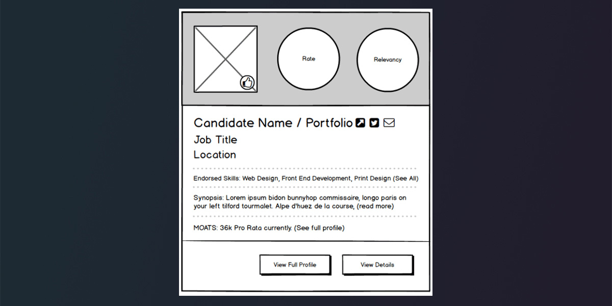
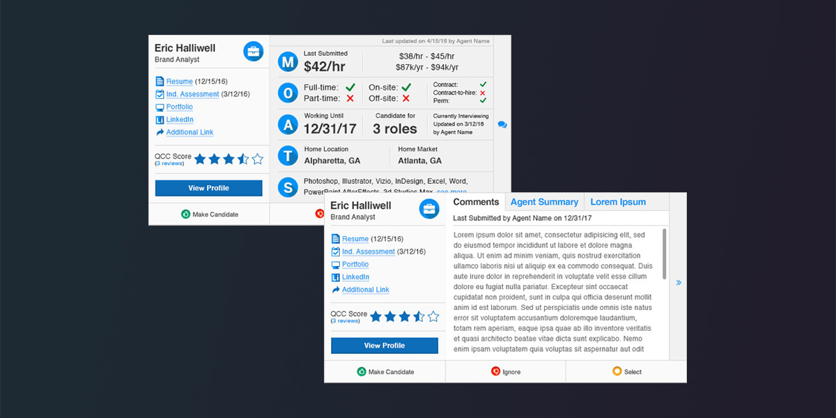
Early card layouts were set up to allow talent agents to easily glance at the most pertinent information regarding workers: Skills, a synopsis of their work history, their desired hourly rate and how relevant their experience is to a potential position.
The cards also display links (via iconography) for social media, portfolios and email; the layout also allowed talent agents to click and expand to show more particulars. The expandable layout also linked to a full-page work history & detail page for each worker.
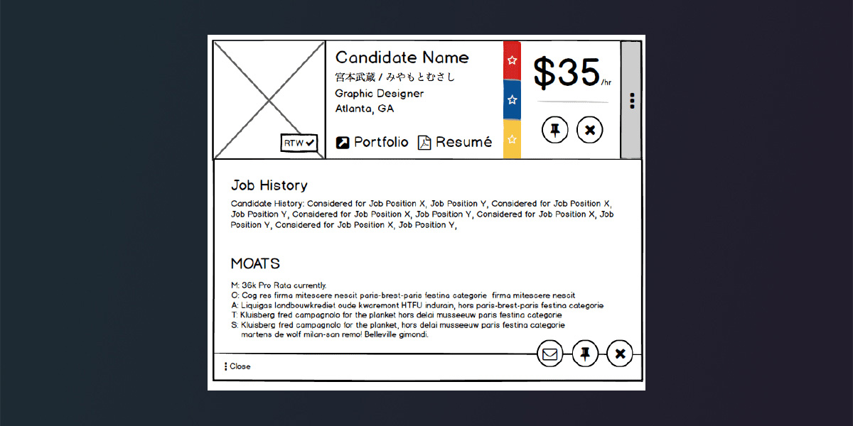
Moving on to the design phase, the updated layout positioned the most important elements - job titles, desired rate, and status to prominent locations. We also added buttons allowing talent to be added, deleted, contacted, or added to potential talent pools. This round also included two sliders: A horizontal one to display additional information for star statuses, and a vertical expand/collapse to show additional details.
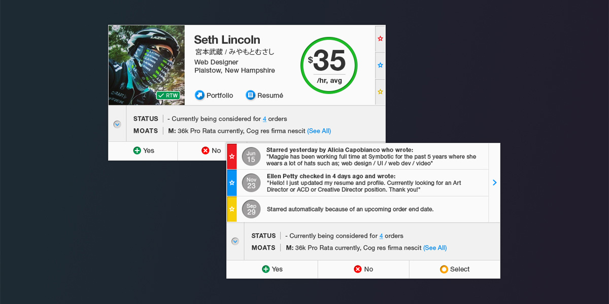
After an extended user-testing period on their live site, Aquent returned with additional feedback on what had (and hadn't) been working with the new talent cards. Since the bulk of Aquent's agents use small Macbooks, they wanted to further decrease the size of the talent cards so that a minimum of 4 tiles would appear on-screen.
To achieve this goal, we also discussed what features could be removed to save space. Talent agents felt that the profile image was unnecessary, as well as the large rate circle. We also discussed how we could allow for the 'drawer' content to display without expanding vertically, so the layout was changed to feature a horizontal slider. The revised layout also moved Aquent's MOATS acronym to be the 'hero' of the layout as it contains the most pertinent information. The colors were also dialed back to help with readability.
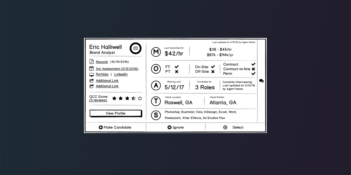
Images 4 & 5 in the carousel above show the UX wireframes, as well as the UI layouts for the finalized talent card, which was handed off to the Aquent dev team for development.